Home is where the heart is
AD David Horton from Hecht Horton partners called with an assignment for Tufts University Alumni magazine. Tufts has been a great client over the years and I have enjoyed working for their various publications. This assignment focused on how various first year students try to create a sense of home for their first real experience away from home. Since I had just finished a major move, it was a very relatable story. For some reason, the old “Flying Toasters” screen saver popped into my head as the perfect inspiration. In this case this was an assignment whose answer has always been in front of my face.
Multilingual multicolored
The Chronicle of Higher Education called with an assignment about the how multilingual people see the world versus people who speak a single language. Turns out the world is seems more varied and bigger for those who speak more than one language.
The structure of language is fascinating and one of the more surprising facts about language is spacial perception and interpretation of common occurrences is altered based on your native language. My approach for this assignment was the idea that each language has a different color so naturally having more languages add a wider spectrum to how you view the world. Much thanks to AD Janeen Jones for the assignment.
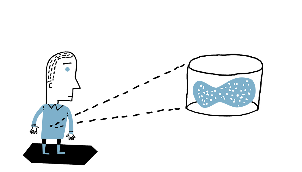
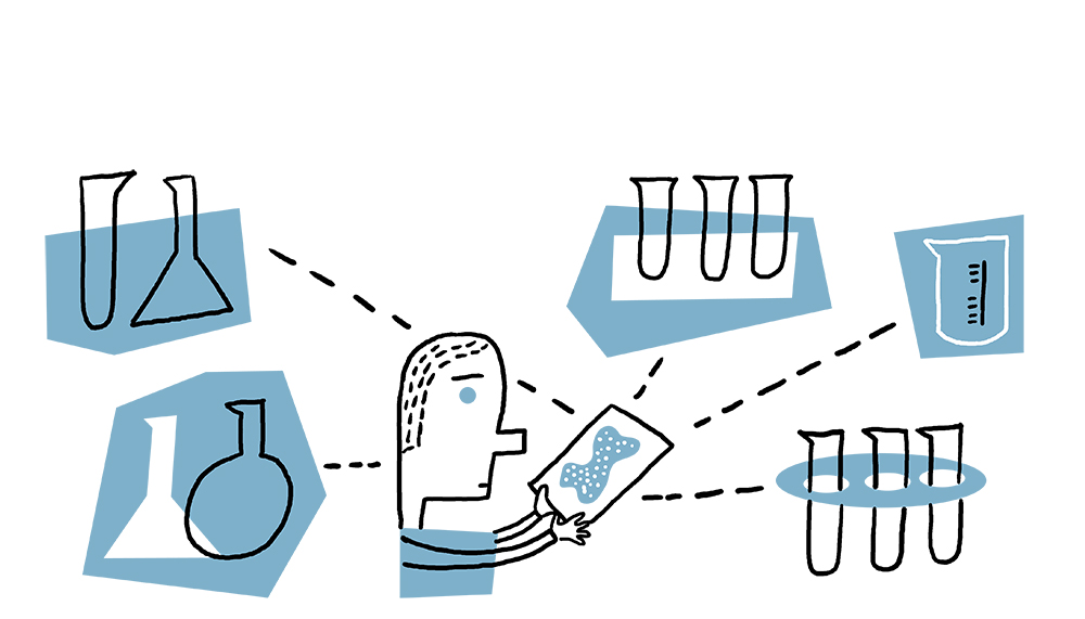
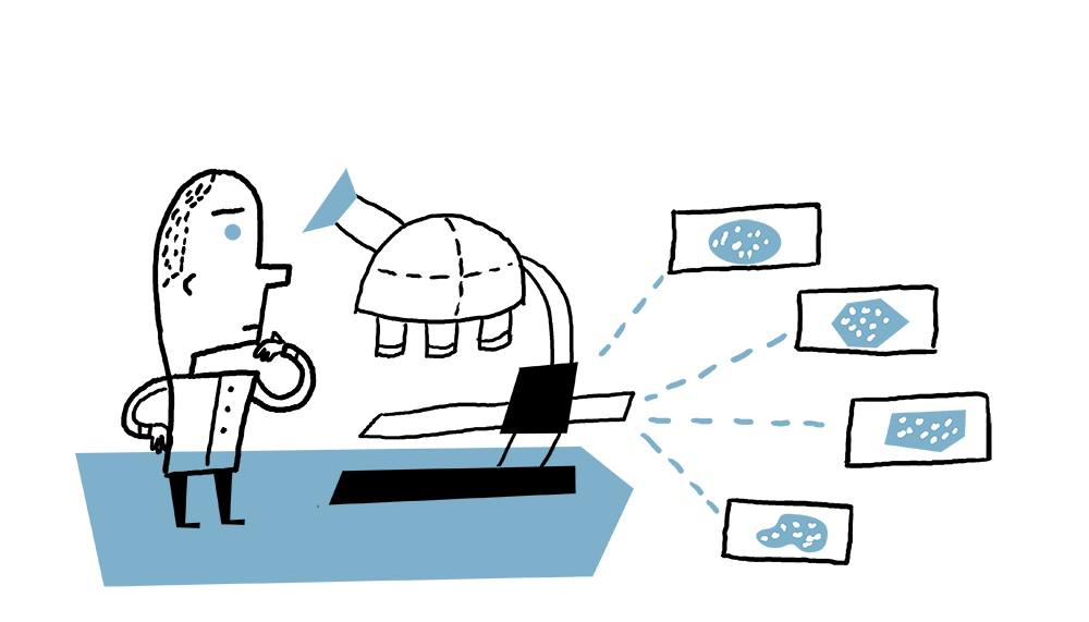
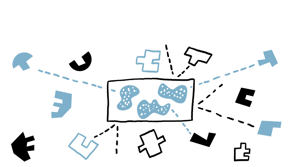
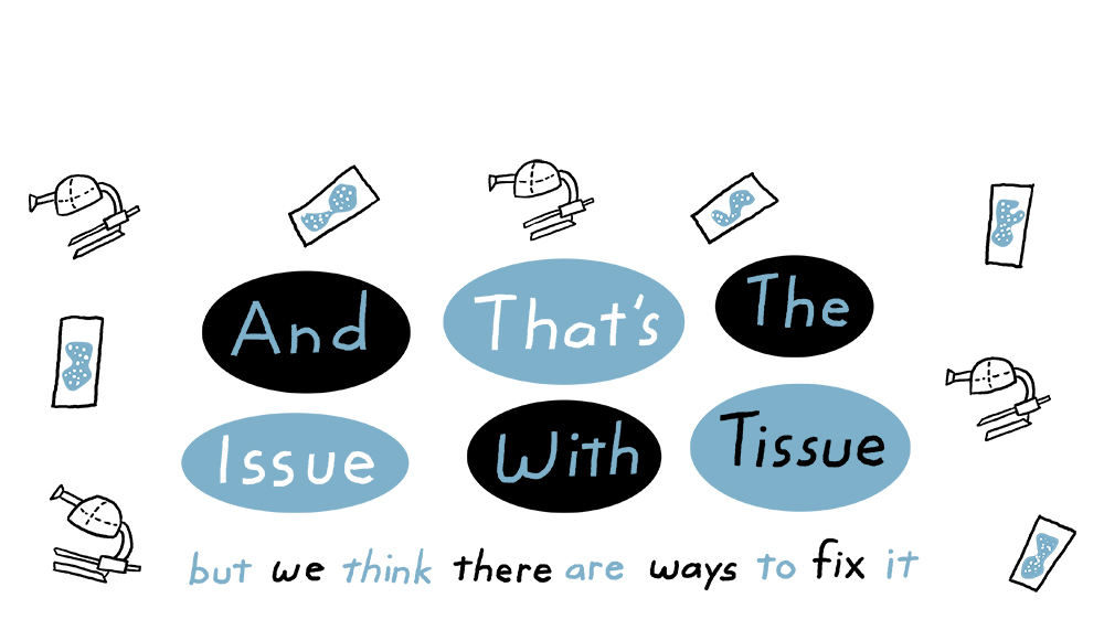
Genentech: The Issue With Tissue
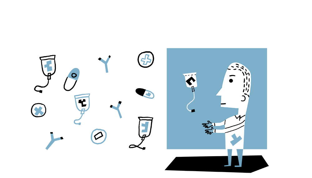
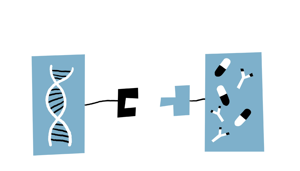
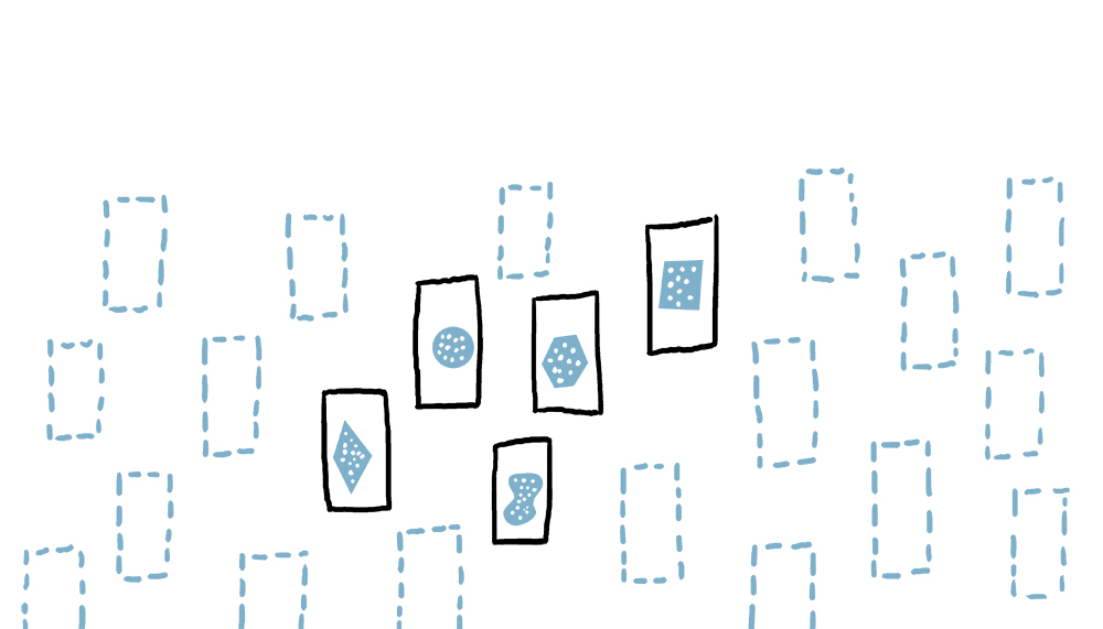
This is part of a continuing series for Genetech’s site to help explain a variety of complex concepts. This series explains the issues researchers must consider when using tissue samples for research. Producer Nick Miller and the rest of the production team have done a great job a figuring out a process so we can digest and break down various biotech concepts for a wider audience. If you would like to see the series which uses limited animation please visit here.
Boundless Brooklyn
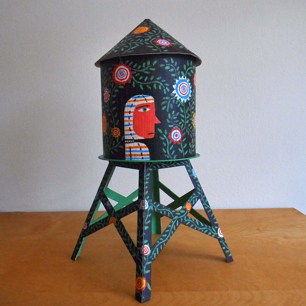
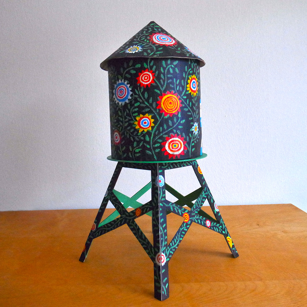
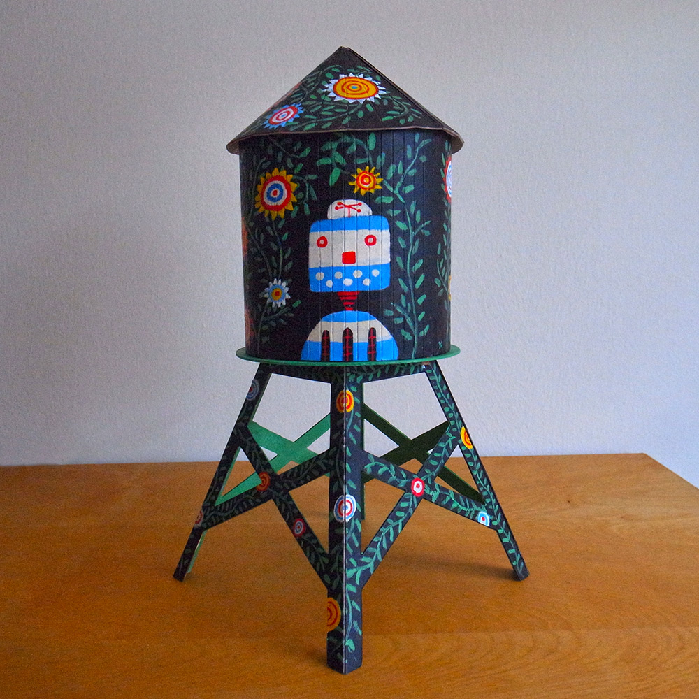
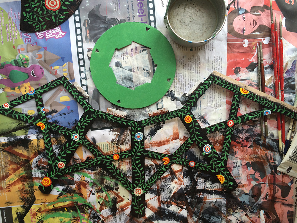
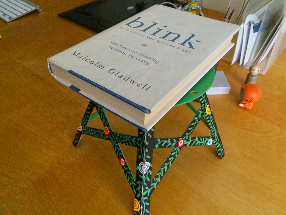
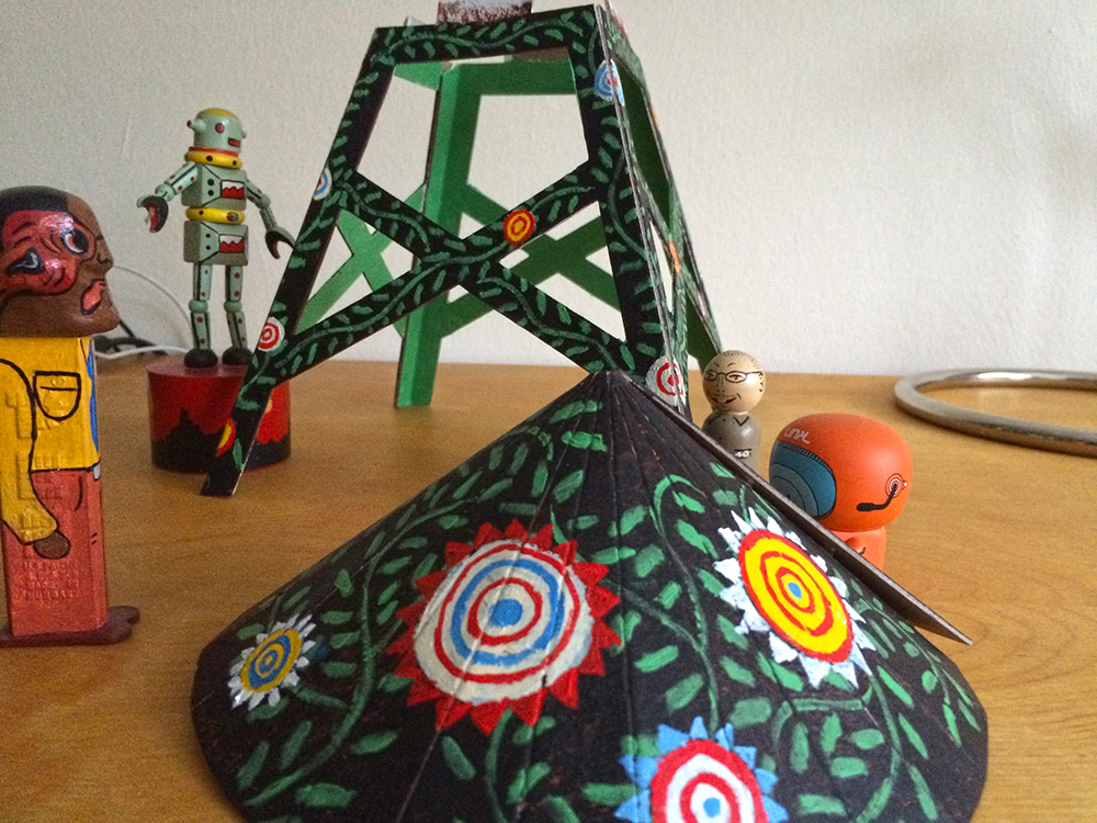
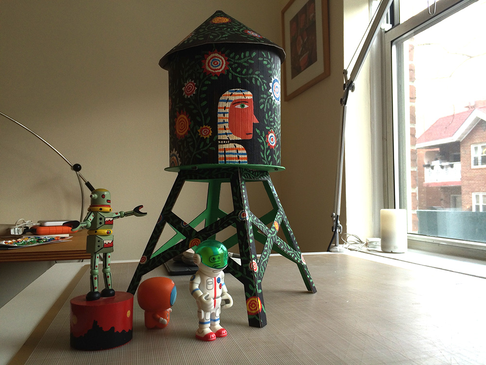
Boundless Brooklyn asked Chris Buzelli and SooJin Buzelli to curate an exhibit featuring 50 illustrators painting 50 water tower models. The opening is April 3rd at Kikkerland Shop on 493 6th Avenue in New York City from 6pm to 9pm.
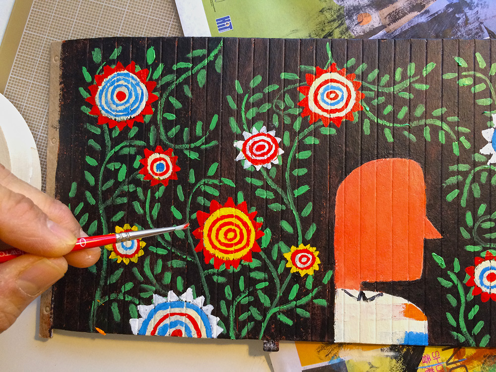
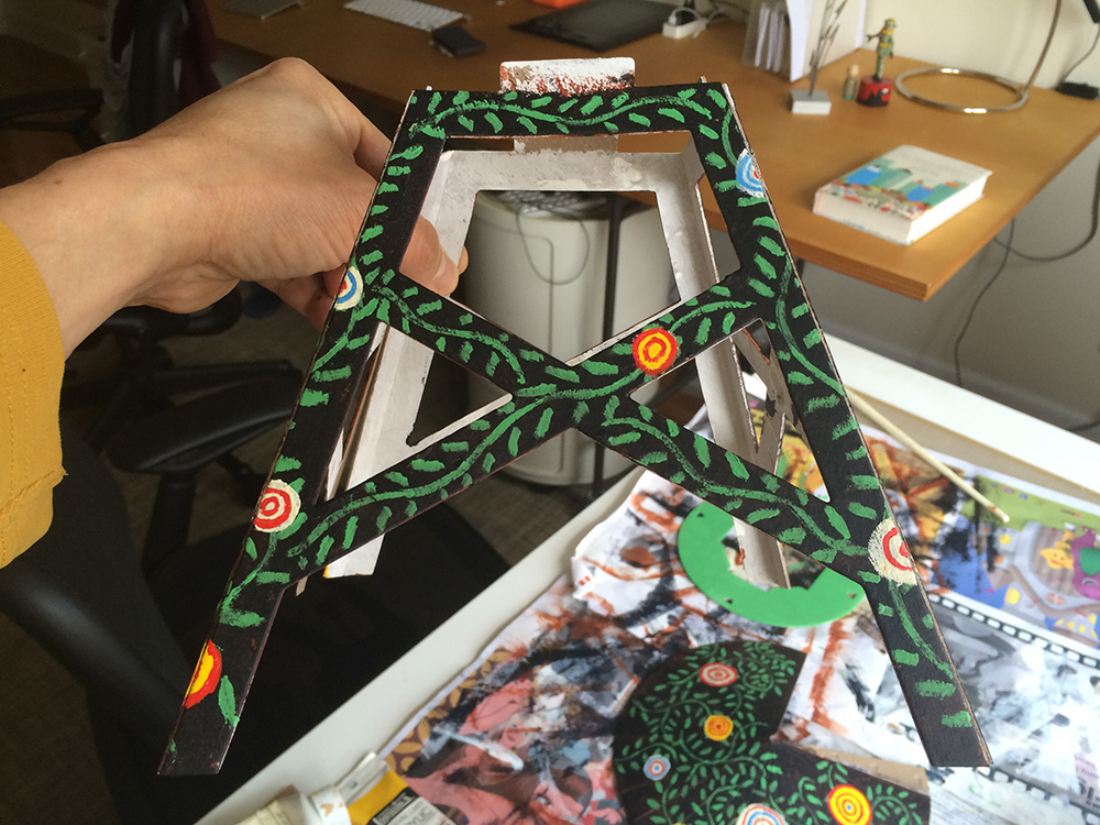
It has been a while since breaking out the paints but it was nice to create analog art again. My tower is based on an illustration about singularity commissioned by Nautilus Magazine about the merging of Robotic and Human intelligence. The pattern in the original illustration seemed perfect for a 3 dimensional object and a nice way to dive into the deep end of the painting pool. I had forgotten the emotional connection one can have while painting. The process can be very meditative. It was a bittersweet when the tower was complete.
Please pop by the exhibit, I’m sure it you will be blown away by all the participating illustrators.
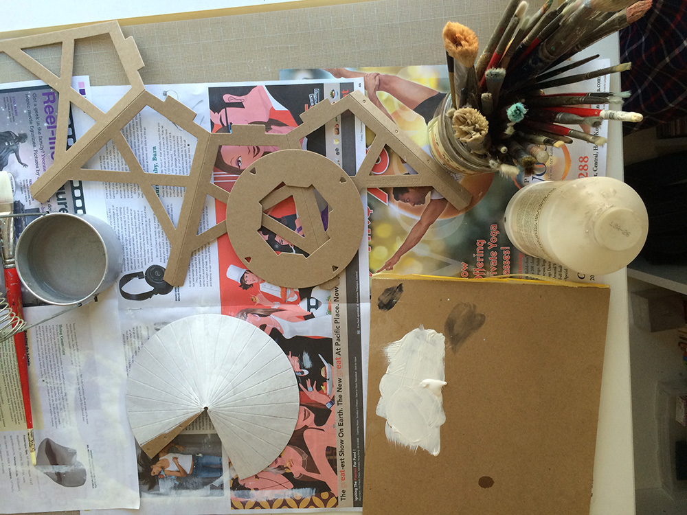
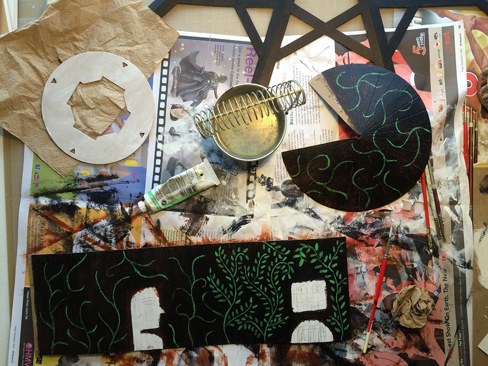
For fun, the work in progress appears after the tower:
Bathroom talk
My life is nothing if not ironic. Fellow illustrator and friend Otto Steininger recently did an illustration about a new medical procedure for transplanting poop. Naturally I had some fun at his expense. The freelance gods decided to teach a lesson and AD Valarie Morgan at Hour Detroit called with an assignment for the exact same procedure!
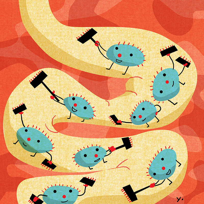
Turns out it is a very fascinating procedure and donors are extremely healthy people with high quality bacteria for digesting. The bacteria cleans the system so those who lack this bacteria can develop serious problems. The donors poop contains the bacteria so a small amounted is placed into the digestive tracts of patients so they can grow their own good bacteria.
Valerie called because she felt I could navigate a delicate subject matter. The bacteria seemed the obvious point for focus and the intestines are basically an organic tunnel like a subway so they could be rendered with a fun approach.
I wish to apologize to Otto for teasing him because this turned out to be a very fascinating assignment.
Bigger and better
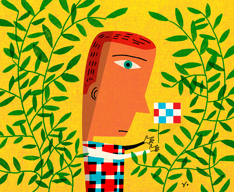
AD David Stokes and I have worked together for many years so we have seen the evolution of print and web together. His latest assignment is one of many I have received lately requesting formatting for the newer parallax approach to web design. It’s a welcome new development for illustrators since the art spans the width of the page. Because of the new format, an image needs to work with a variety of cropping options for different screens.
The project was a feature about asset managers who find size is a benefit to performance. Also requested were characters based on quotes from managers. We went for a bold simple solution which (lucky for me) works well with the newer trends in web design.
Finding order
The Chronicle of Higher Education had a fascinating article to illustrate about a professor with OCD who needed to figure out how to navigate a world that seems out of order. The answer turned out to be finding small pockets of order to deal with the larger world. A Rubic’s cube seemed to be an apt metaphor for the struggle and process needed to organize one’s thoughts. Scott Seymour, AD.
