Damages
The Your Money section was a special collaboration between the New York Times and NPR. In addition to the cover series, I was asked to illustrate an essay describing the experience of a couple trying to navigate a relationship thought the trauma of the recession. Having seen how the recession rocked almost everyone I knew, it was an easy story to empathize. The metaphor which came to mind was the cycles of a tree burning. It caught both the idea of damage and time needed to repair the damage. Fred Norgaard who was the AD, agreed.
The Your Money series was a great experience and it was a pleasure to complete the series with this essay.

Your Money for the New York TImes
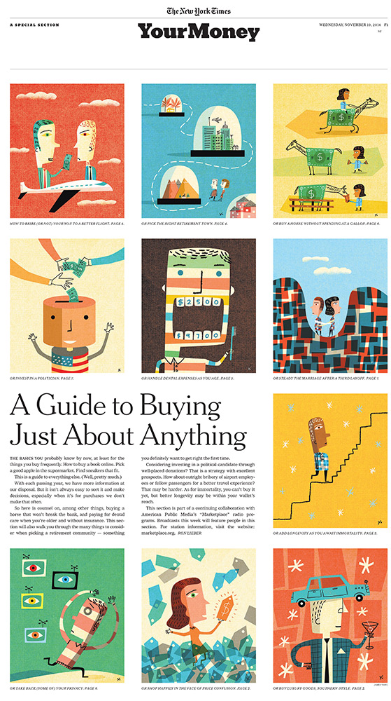
Fred Norgaard called with an exciting but scary project: he needed 10 illustrations over the weekend for a special section of the New York Times about your money. He provided a color comp pulling images from my site. I love when designers do this because it does help me understand the feel they want and it was clear Fred wanted something which popped off the page. There was definitely panic at the start because Fred pulled some of my strongest images for his comp. Since he wanted a variety of color schemes, it was helpful for planning the color sequence. I decided the dental image needed to have a dark background to provide a hub for the other images. Much to my relief everyone was thrilled with the final result and frankly, the color comp Fred provided was a huge help.
Here’s the final layout:
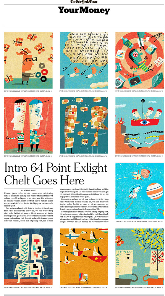
And here was the comp:
2 for Society of Illustrators 57
Received a pleasant call last evening from the Society of Illustrators. Turns out 2 pieces made it into the Advertising and Institutional Show. Having judged this year in the Editorial category, I saw how difficult it was for a piece to be accepted. This is my third time judging and the quality of entries was easily the highest I have seen. Much thanks to the Advertising and Institutional judges and the Society for the great news.
Program illustration for Teatro Alla Scalla’s production of Lucia di Lammermoor. Agency: TITA (Milan), Art Director: Dario Pianesi, Coordinator: Hélène Le Cannu.
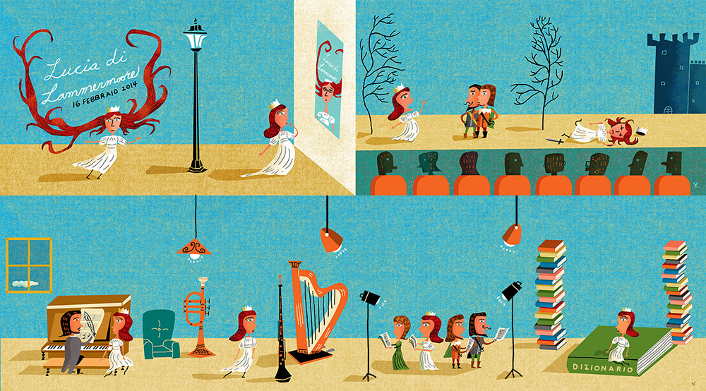
Illustration for feature about building cities in the future for Sphere Magazine, a shareholder publication for Hutchison Whampoa. Agency: HK Media (Hong Kong), Publisher: Greg Crandall, Creative Director: Pierre Pang.

Ghost in all of our machines.
The Chronicle of Higher Education and I have had a long relationship and it’s thrilling to see more of their stories getting attention on a national level. Ellen Winkler called with an interesting essay about how the internet and human interaction has created a sense of groupthink. Instead of creating unfettered intellectual growth, it has created a strange group dynamic.
It’s always fun to create ideas about the relationship between humans and technology and my approach was a simple one of the crowd rushing headlong together with an altered collective mind. Since I was a science fiction geek, it was easy to find metaphors. Much thanks to Ellen and Chronicle for always providing interesting topics.

Mine, all mine.
AD SooJin Buzelli called earlier this fall for a story in CIO magazine about asset managers who realized it might actually be a good idea to buy a stake in companies of other asset managers. They realized they would be the best people to analyze asset managers so they should be able to make wiser decisions.
Working for SooJin is fun because she specifically does NOT want typical business imagery when illustrating stories about finance and investing. The essence of the story is about collecting so I tried channeling Dr Suess to come up with playful metaphors and devices for collecting. As usual, SooJin picked the idea I felt was strongest.

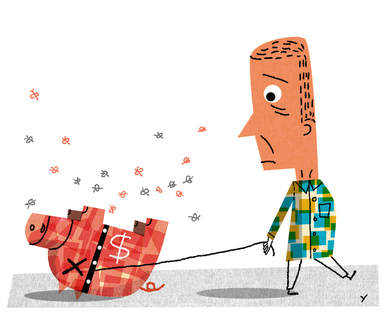
End of the line.
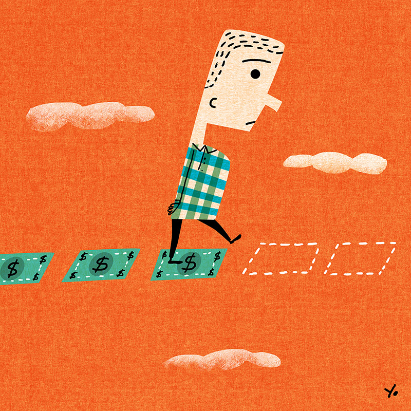
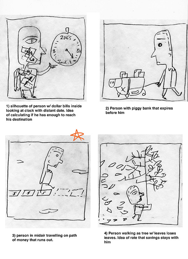
Last week was a strange karma week. More than one friend called and asked for advice about retirement. The main theme was friends were worried they had not saved enough or were not saving early enough in their careers. By chance, Fred Norgaard from the New York Times called with an article titled, “Do you have enough saved for retirement?” for a special section on wealth. Since the main worry I heard from friends was outliving their savings, many of my ideas tried to catch this anxiety. Fred and I agreed on an approach which emotionally caught the story, but we almost went with a more humorous approach. After finishing the approved sketch, I went back to finish the alternate idea since it was also strong. Much thanks to Fred and I hope everyone is able to sleep a little better about their finances.
This was the approved art which went to final. Fred and I really liked the tone which we felt would catch reader’s anxieties.
This was the more humorous concept we also really liked. It was very close to being picked. I went to final after the assignment since it was a fun approach.
Sketches. The first was a more “literal” approach then I played with the anxiety angle for the rest of the sketches.
Free your mind
Michelle Furman, art director for American Teacher magazine called requesting a series of illustrations for a feature about reimagining technical education. The article was the challenge to rethink the role of education and realize there was much untapped potential. The theme of breaking out of boundaries became the theme for the illustrations using a butterfly as a metaphor for potential. Michelle specifically asked that the metaphor be carried through the series and it turned out to create a nice flow through the series. Who knew that butterflies would one day be something I enjoyed drawing?