Follow the leader
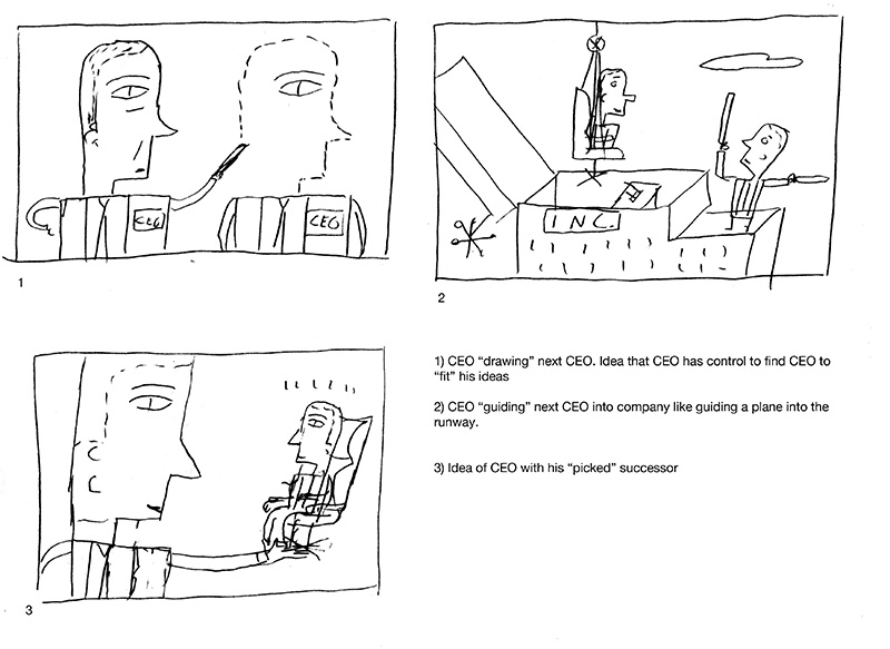
As every illustrator knows, working with a daily paper like The Wall St Journal can be like a Top Chef challenge with the tight deadlines. You need to make something good looking and smart within a very tight window. Dan Smith and I have this down and it’s always satisfying when finished. He had an article about CEO’s choosing their successor which is a great topic because it is about forming another person who reflects yourself.

This was a happy instance where AD and illustrator agree which sketch is the best. I felt the chosen sketch nailed it both conceptually and graphically. Number 2 would have been great for a more humorous approach. Number 3 would have worked fine too but the success depends on execution to make it more interesting.
horizontal
It has been an interesting trend for the flow of work in 2014. Projects have ranged with assignments from magazines for multiple illustrations per issue to various cultural events, branding, and an animation collaboration for The Impolite Genteman. For some reason, quite of few projects have required a very horizontal format which were assigned even before the series of 100 cards for Moo.com. At first the extreme format was a struggle but have finally unlocked the code for making this work with my head. Now it has become a very fun challenge.
Here are a a couple of the fun horizontal images this year:
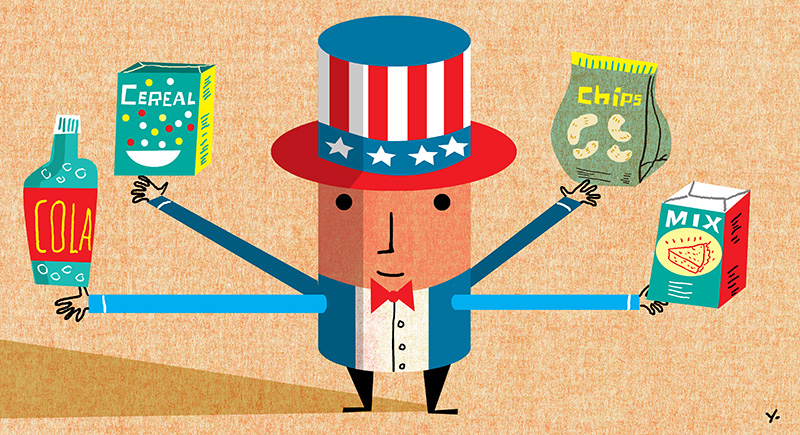
1) DBusiness Magazine: Global reach of US automobiles. Kathy Moore, AD

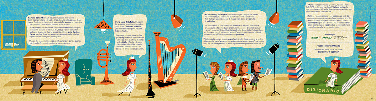
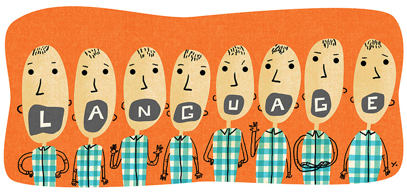
2) Smithsonian Magazine: Let’s talk about Language, Erik Washam, AD
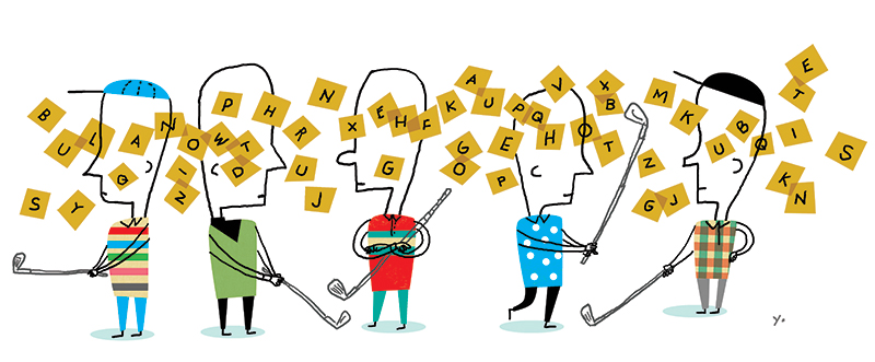
Golf World Magazine: Words with Friends on Tour. Jennifer Corsano, AD.
High Anxiety part 2
2014 has been a pleasant surprise with requests from more publications for a series of illustrations for a feature. It’s enjoyable for me because it’s like creating a mini story with images. Here is part 2 of the series done for Experience Life Magazine about misinformation in the food industry. The main theme is a disturbing about of research make public about food that is actually marketing for giant food industries. The main concept which needed to be conveyed was the conflict of interest. Lydia Anderson was the art director and it was fun collaborating with this series.


high anxiety part 1
I was joking to a friend I was smarter before the internet because there was less noise cluttering the brain. Turns out this is a big problem for consumers who want to have healthy eating habits. There is so many conflicting news stories and reports about nutrition and it is made more difficult by deceptive reports about food. Experience Life Magazine had me do a series of illustrations for a feature about being a smarter consumer of information regarding nutrition. Thanks to Lydia Anderson for commissioning such a fun project.


From here to there (on the third try)
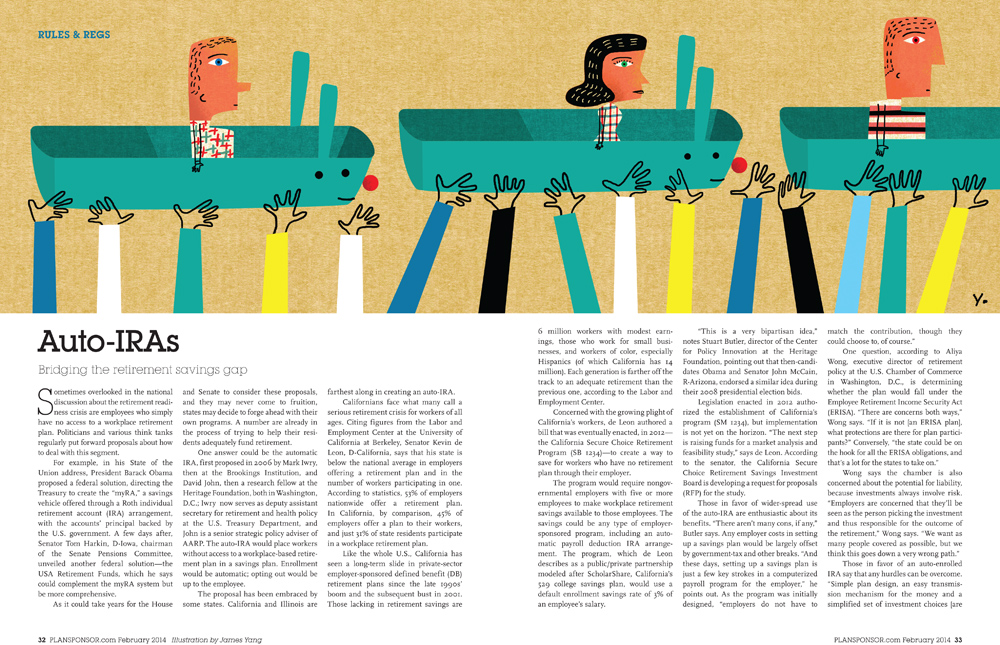
It’s always a treat to work with SooJin Buzelli at Asset International. One would never think a financial client is a place where you can push yourself creatively as an illustrator but this is exactly what happens at Asset International. This illustration was for an article about putting your retirement planning on autopilot. The extreme horizontal format was a format which was difficult in my earlier days but these days I really enjoy playing around with it. This was created for PlanSponsor magazine.

For some reason, it took me a couple of attempts at the final before I was happy with a version which I felt was SooJin-worthy. It was a classic case of an idea looking better in your head than in reality. The first attempt didn’t work for me because it didn’t feel playful enough and the image does suggest an amusement park type of metaphor.

Tried another version adding more colors but it looked fragmented or pasted together.

Started channeling some of the great european illustrators from the 60’s and early 70’s and finally hit on the winner. The final version in print made me very grateful the third time was the charm.
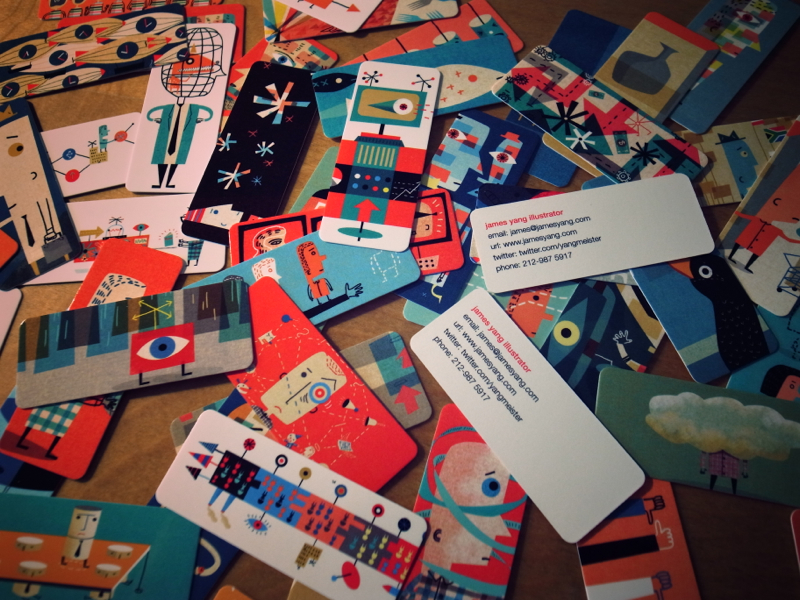
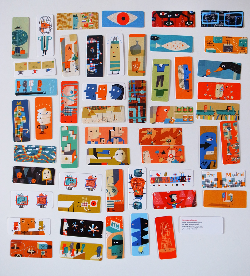
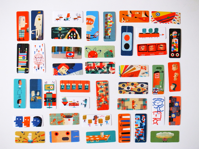
100 Minicards for Moo + Interview with Rockpaperink
Editor Emily Potts called with a fun project to create a custom set of 100 mini cards with rounded corners for myself as part of a campaign by Moo.com to have creatives from many disciplines showcase the possibilities of their mini cards. It is amazing how easy it is to customize cards these days and it was fun collecting, reediting and cropping images from past work to create a cohesive collection.
Here’s an interview with Emily on Rockpaperink about the cards.
Client: Moo.com Editor: Emily Potts
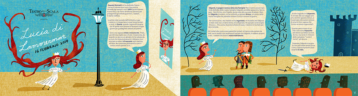
Lucia di Lammermoore (Milan)
Hélène Le Cannu from TITA (an advertising agency in Milan) contacted me for a fun project for La Scala In Famiglia which is a series of performances meant for children. I was asked to create an image for a piano accordion style guide for the opera, Lucia Di Lammermoore. The main concept for the art is Lucia as a tour guide guiding the audience through the opera. To make this idea work, I approached the composition with characters and elements as toy figures in miniaturized set. It was also fun to finally see my characters with facial hair. Much thanks to Hélène and TITA for a fun project. Dario Pianesi, AD
Poster and Guide for Lucia di Lammermoore. Agency: TITA srl (Milan)