3×3 International Illustration Show: The Egg Story
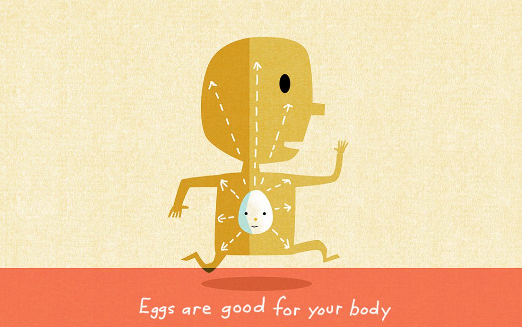
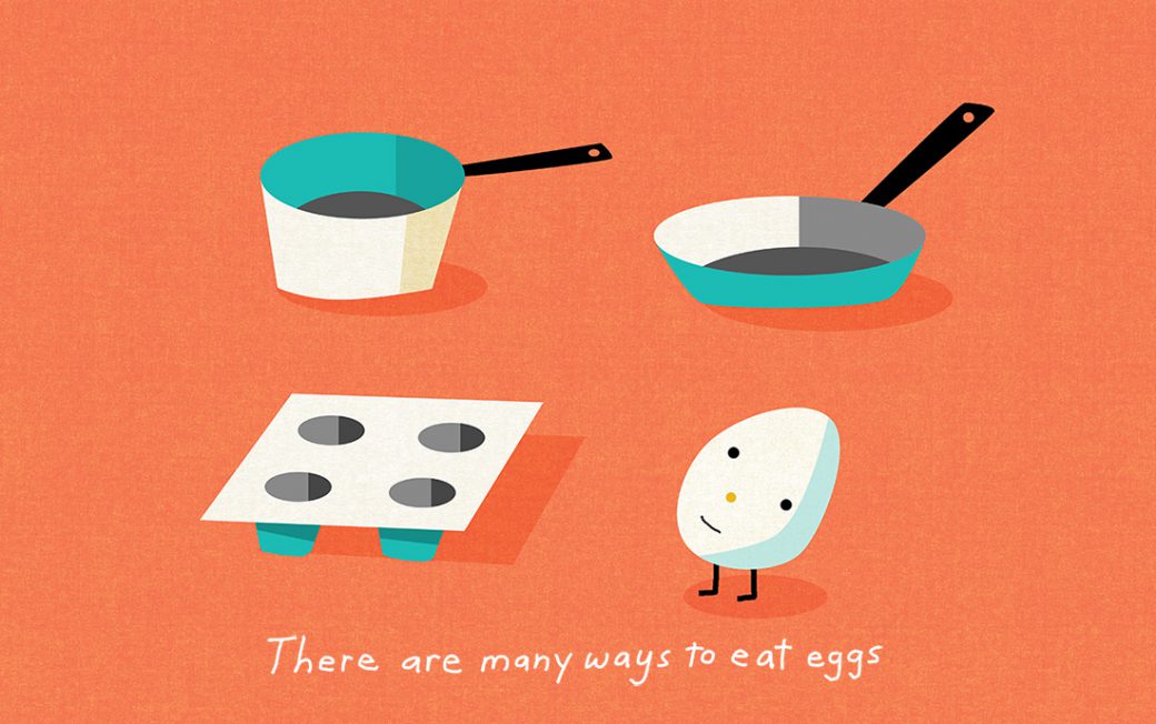
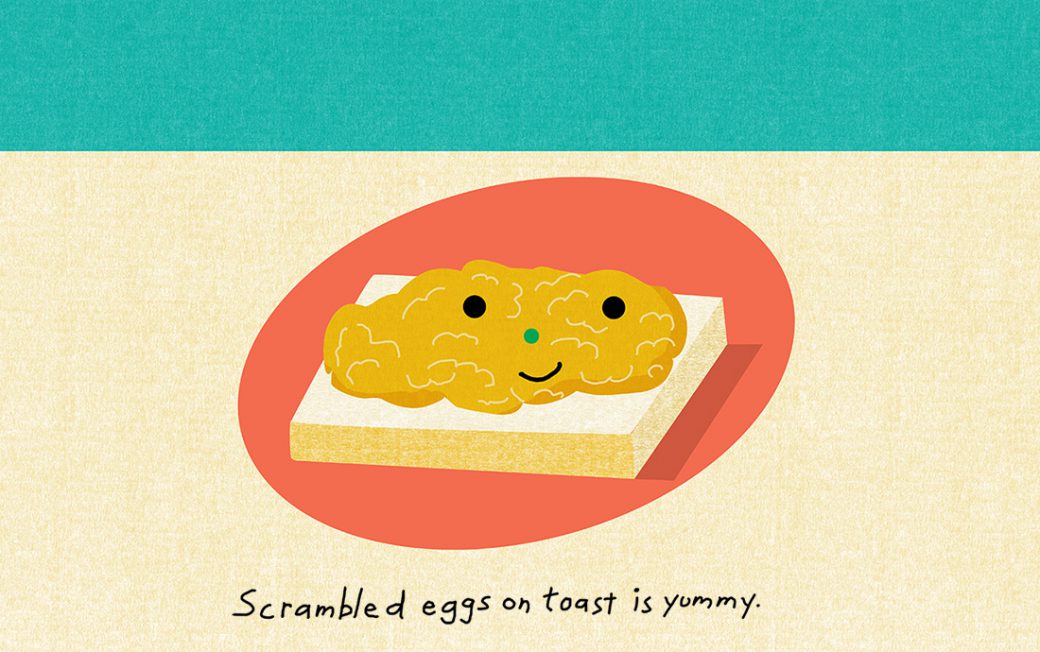
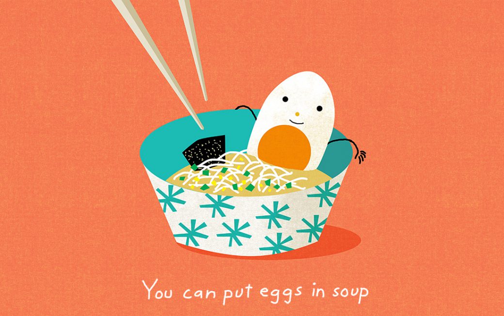
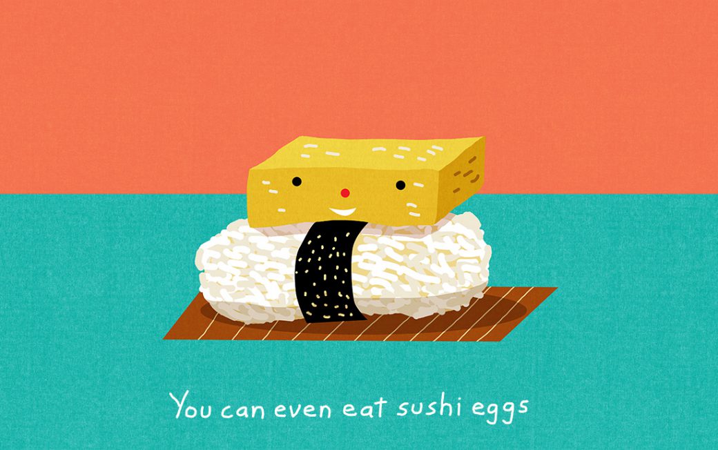
It has been a very good award season for the Egg Story which is part of an illustrated storytelling series for iammama.com. The series has won a bronze award in 3×3’s International show for picture books. This is the third award for the series this year. 3×3 is a publication near and dear to my heart and publisher Charles Hively has been very supportive of my work. Much thanks to show chair Rod Hunt and the rest of the judges for including me in this year’s edition.
Northern Contemporary Gallery: My Petite Bourgeois Revolution
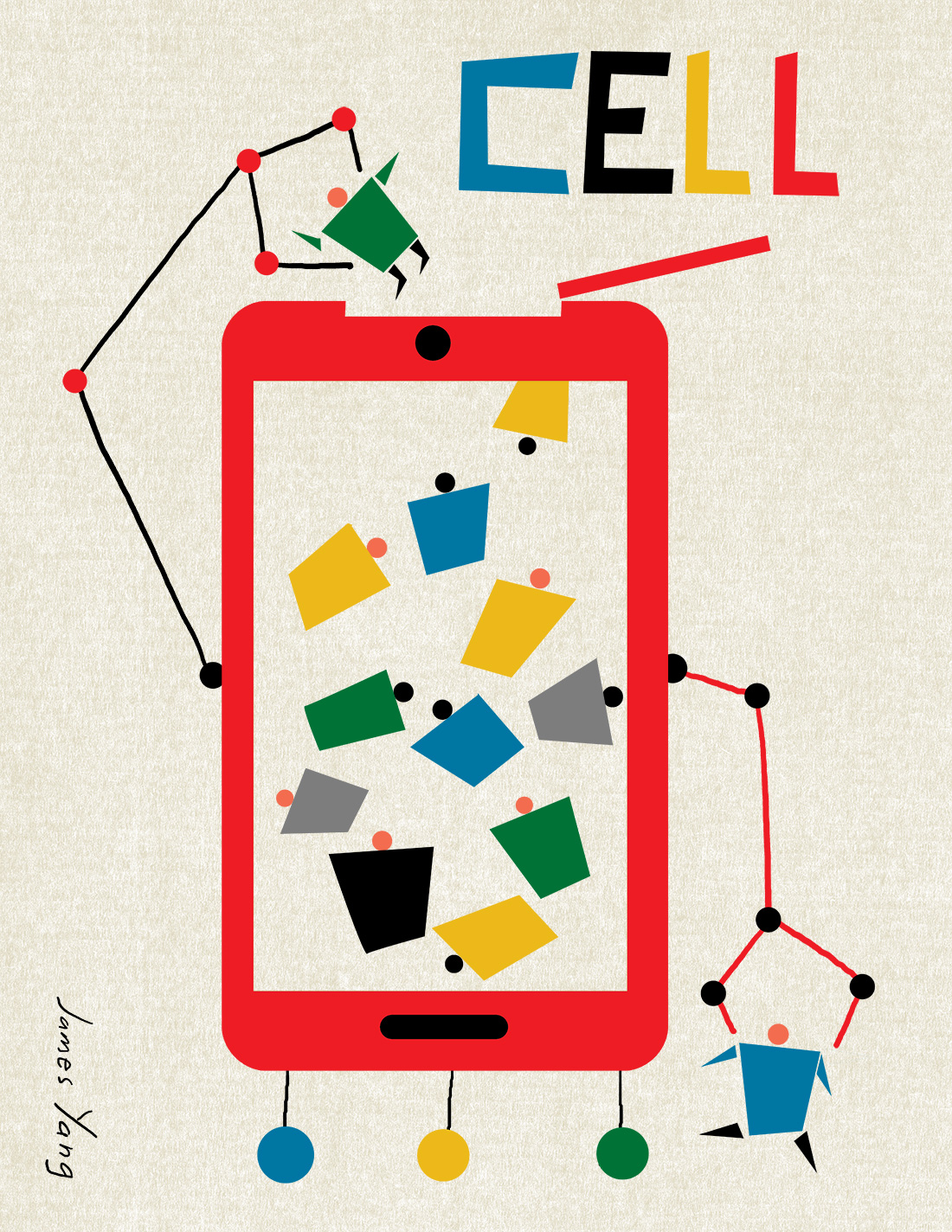
Print for the Exhibit, My Petite Bourgeois Revolution at Northern Contemporary Gallery curated by Hitoshi Murakami. HItoshi asked the artists to create an image inspired by the Russian Constructivist posters about the modern struggles which vex us all. It is meant to be a humorous exhibit and immediately relationship we have with our mobile devices provided fertile ground. I wanted to catch the idea how mobile devices have devoured our lives while still creating an image someone would like to have on a wall. The print will be available for purchase during the exhibition and I will provide details once the exhibit opens.
Consumer Report: Skipping Antibiotics
AD Jennifer Corsano called with a special edition assignment for Consumer Reports. The edition was about pain management. The editors wanted images with a lighthearted yet not frivolous feel. Sometimes the job of an illustrator can feel like a contestant on a cooking show but fortunately I love these challenges. Paul Rand was a believer a smart solution existed for every project and it’s something I always keep in mind. In the 60’s there were many cool instructional videos with cartoons and this turned out to be the perfect source of inspiration.
Parents Magazine: The wrong mix for ADHD
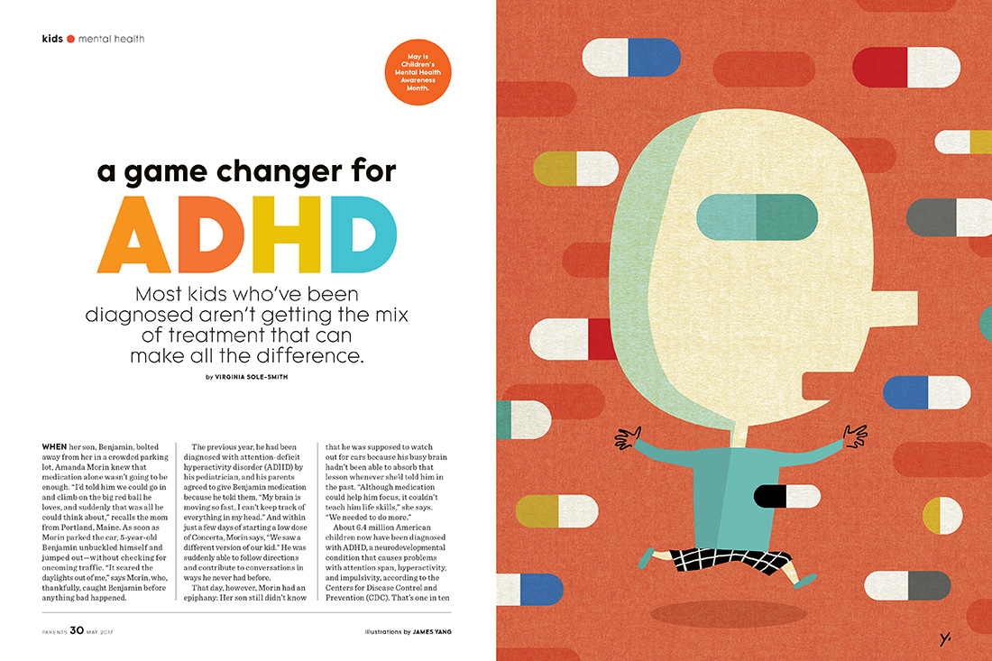
Parents Magazine has made it into the Yang inner circle of trust. They have become a regular client and AD Emily Fulani does a wonderful job designing pages. The most recent assignment was right up my alley. She had a feature about finding the right mix of treatments for children with ADHD. This is going to sound strange but pills and capsules can make for a powerful graphic statement. I suggested a child running through a sea of pills with a pill for the eye as the “correct” treatment. Emily was enthusiastic about this approach and for both of us it turned out to be a favorite that I have done for Parents. It is a great feeling when you start to really sync with a client.
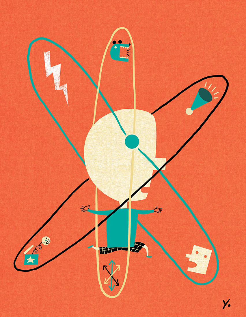
The secondary image was a metaphor for the distractions which a child with ADHD must manage.
Here is how the opener looked with the type:
Awards: 3 selected for American Illustration 36
Great News from the Judges and Jury for American Illustration 36. Three of my entries were selected for the awards annual. Out of over 10,000 entries 380 were selected for inclusion. Needless to say, I am thrilled and it is truly an honor to be selected by the jury. Much thanks to Mark Heflin who always does a great job with the show.
Two images were selected from the iammama.com picture story about eggs. Iammama is a site for young moms in Asia.
Very thrilled the poster for the MTA Art Card program was also selected. Amy Hausmann, AD
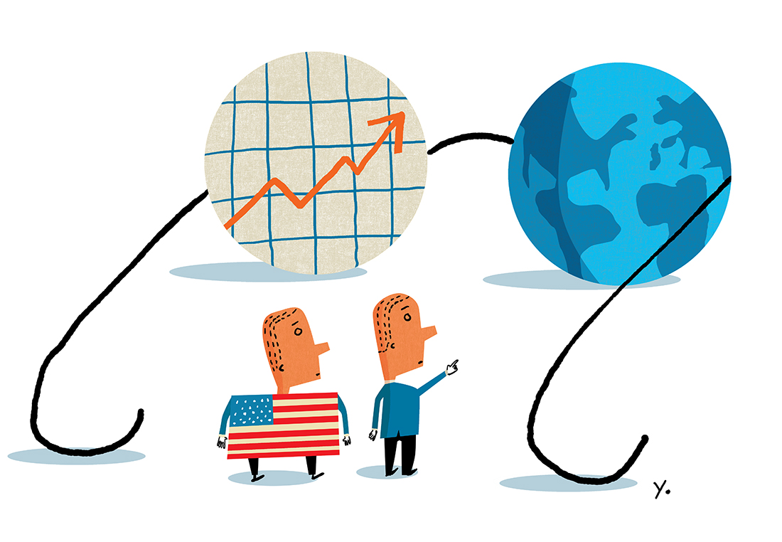
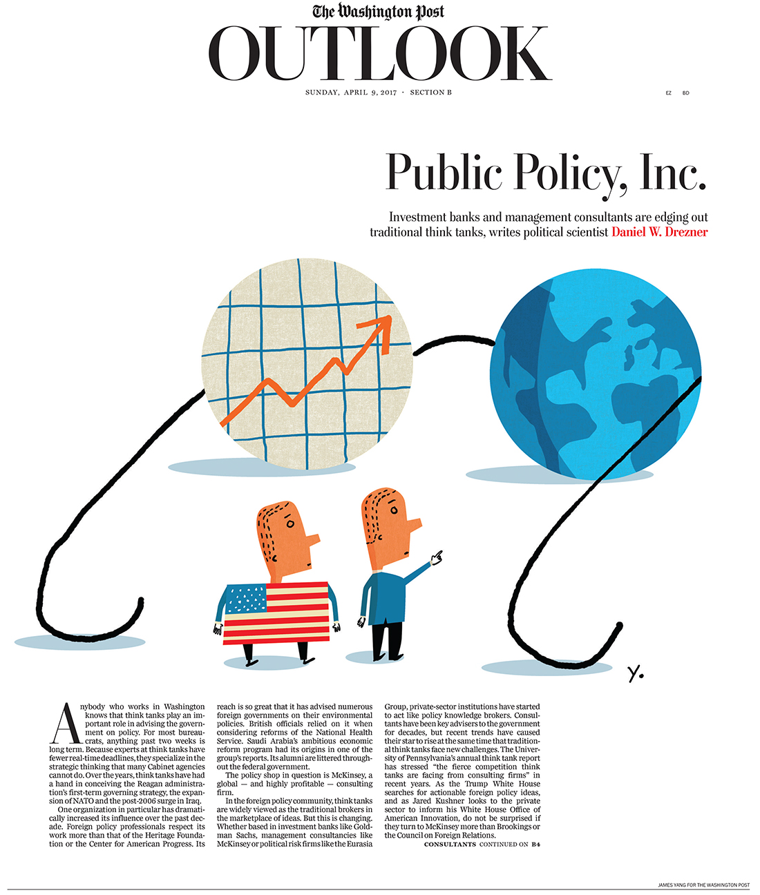
Washington Post: Policy for Profit
The Washington Post has been on a tear lately and I was thrilled when AD Chris Rukan called with an assignment for the for the Outlook section. The story was about how policy making which used to be developed by think tanks is now being formed by for profit consulting firms or branches of larger corporations. The article focused on how a profit motive may skew analysis for government policy. Chris decides if the art needs a background after seeing sketches and we both agreed this idea would work best with white. It’s always exciting to work for one of the great papers.
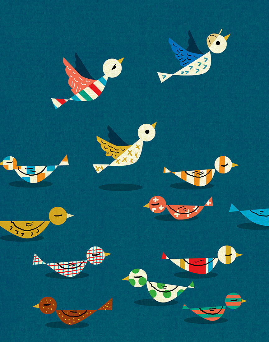
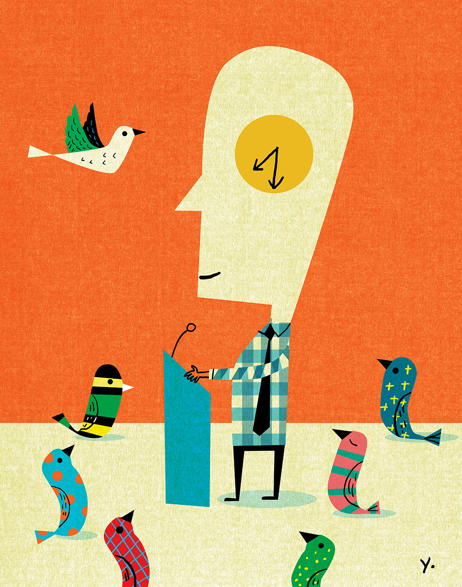
Duke Magazine: The Early Bird
University Magazines have become ideal publications for illustrators. The formats are large and many use quality printing and paper which is nicer than many commercial magazines. AD Lacey Chylack from Phase 5 Creative called with a fun assignment for Duke Magazine. Duke needed a lighthearted take on early morning classes from both the student’s and professor’s perspective. They suggested the classic “early bird” metaphor and since I love drawing birds it was the perfect direction. The birds became the metaphor for students leaving and arriving at class and provided a more graphic approach so it would pop off the page. By coincidence it was the first deadline since coming back from Asia so I could empathize with a sleepy eyed student.
