MTA Art Card: The sketches
You’re not supposed to show how the sausage is made but thought it might be interesting to show how the poster for the MTA Art Card Program was created.
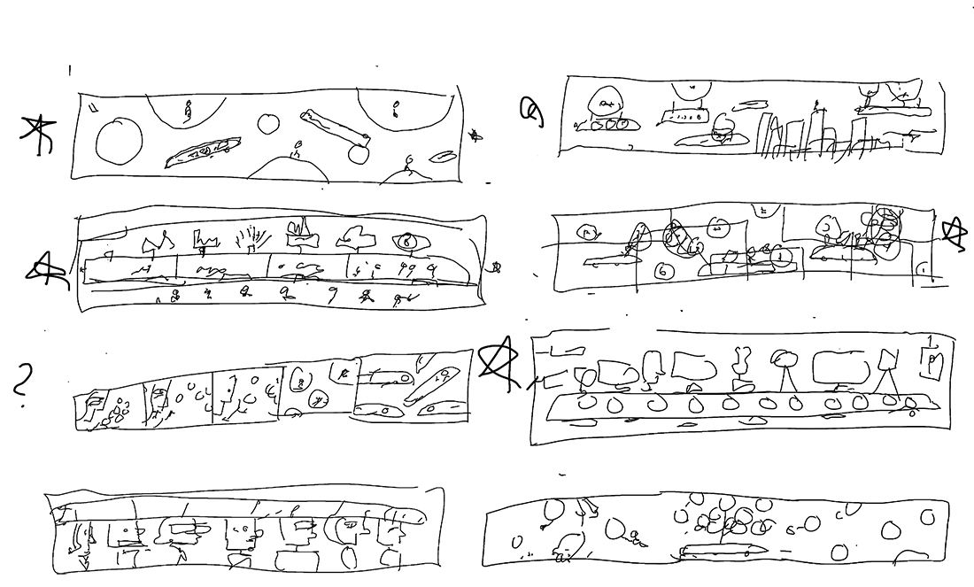
The first round are quick brainstorming sketches which are broken down to basic shapes to see if they can work compositionally. Since they are only for me, the drawings are very illegible. Starred ideas are developed further.
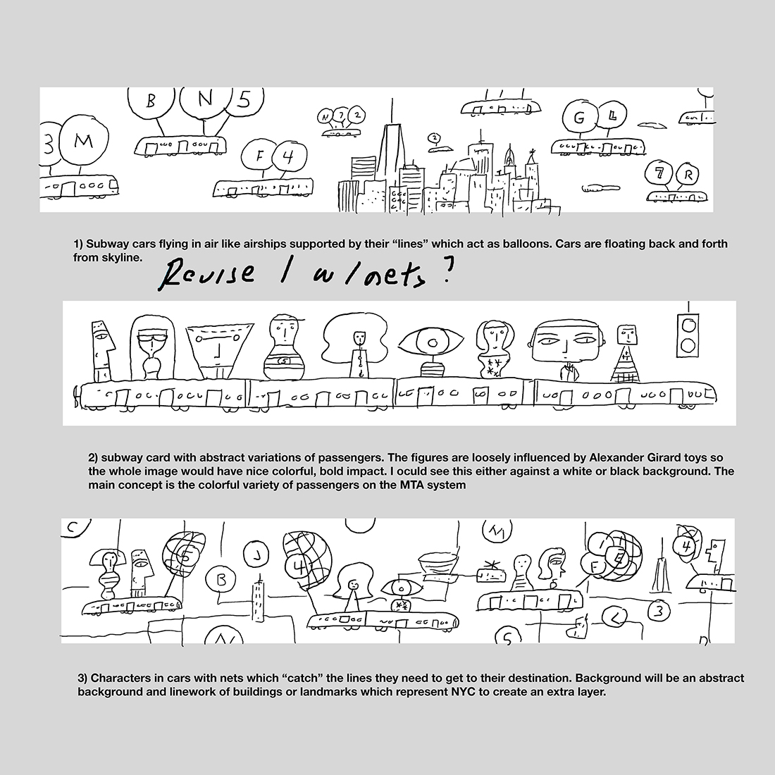
Once refined, the three strongest ideas are sent. The ideas are distinct and strong enough so I’m happy to take any direction to final. Every creative jokes that you never submit an idea you hate because that’s the one which will be picked. Amy Hausmann who is the AD for the program liked all three ideas but really liked the top idea. They had also commissioned two other posters which were character based so the first idea was a nice change of pace. The biggest irony is I consider myself a character illustrator but was happy to try this direction. Amy and her team also liked the basket catching element of the third sketch and asked if I could play around with it for the first idea. They emphasized that if it didn’t work for me they were happy with the original sketch. I thought it could work and provided a another sketch with their suggestion.
We were pleased with how the baskets worked with the first sketch. It seemed more fanciful. Amy had comments which I wrote on the sketch before going to the next stage. Notes from the MTA are suggestions and I found them to be very helpful. You never had the feeling they were commanding you to make a change.
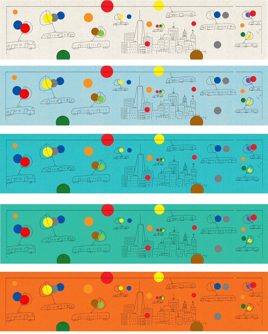
Since this was a complex project from a color standpoint, I suggested submitting tests because the color circles correspond to subway lines. They liked the middle test and asked me to keep in mind that newer trains have a light blue interior. I’m familiar with the new trains and it helped with visualizing how the final poster should work.
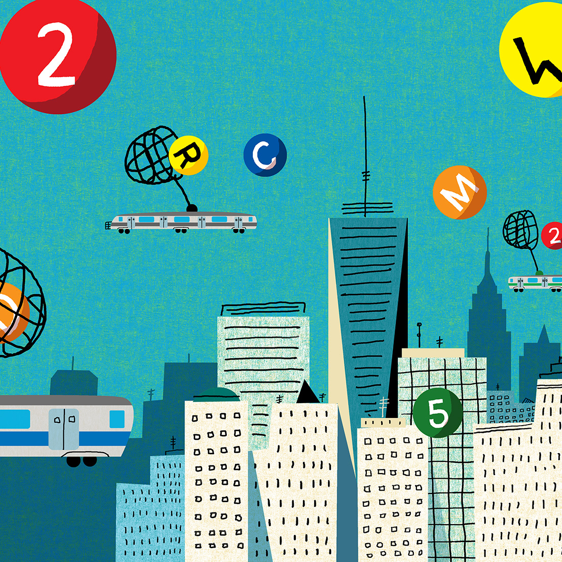
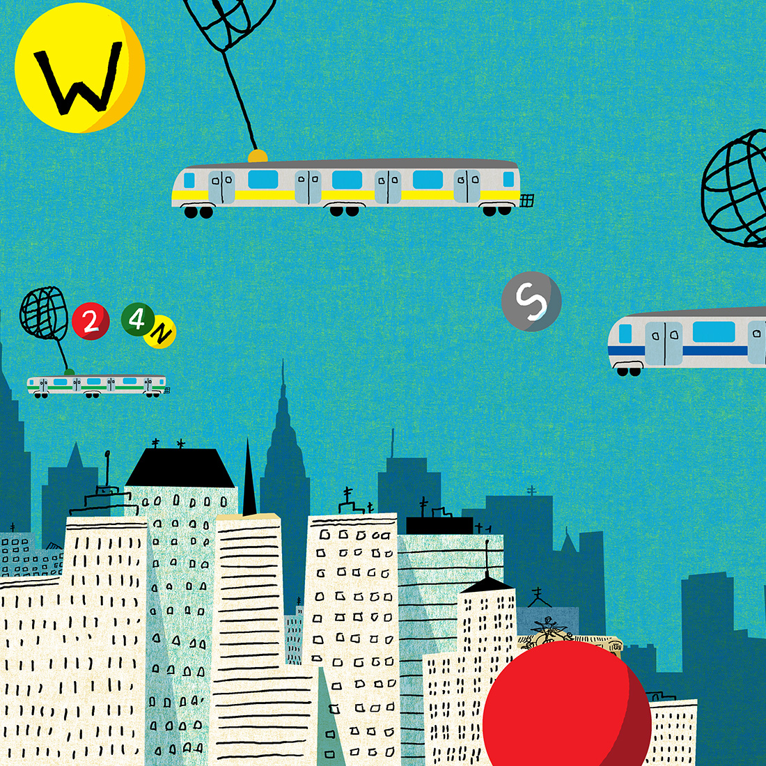
This is work in progress which was shared with Amy and the team so they could have a feel for the texture. The color shifted more towards blue in the final. Amy asked about extending the cityscape and I thought it was a great idea. One day while riding the PATH New Jersey train, the view of the city from the train hit me with the solution for extending the skyline. The main goal was to extend the cityscape while not making the image cluttered.
And here’s the final poster. Amy mentioned the W and remodeled Q lines were opening the same year as this poster so i made sure they were the larger lines featured. While showing a preview of the poster to a friend, she noticed I had left out a line so I made sure to put it in before submitting to the MTA. This project was a great experience where having a team you could trust improve on an original idea.
MTA: Art Card Program
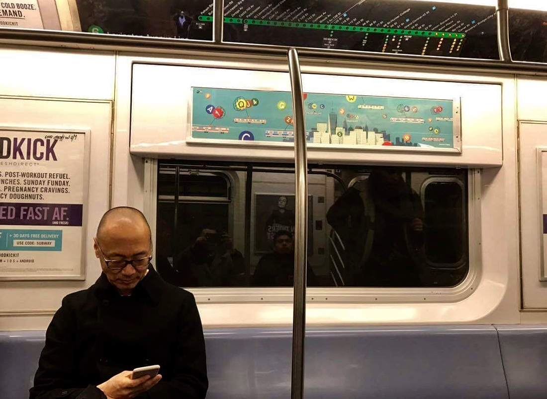
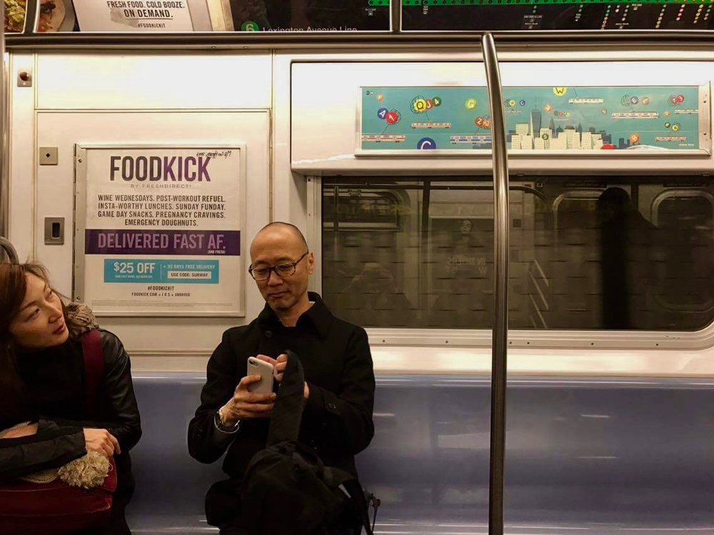
There are projects on my bucket list and much to my delight Amy Hausmann who runs the wonderful subway art card program for the Metropolitan Transit Authority asked for a poster which would appear in subways cars on the MTA system in 2017. Amy wanted an image based on my experience riding subways and encouraged letting the imagination run free. My main goal was to create an escape for the rider so cars flying in a Jetson-like manner around the city while catching the “lines” struck as a perfect idea. Every New Yorker knows the colorful circular icons for the lines and since I am a color guy it was the perfect element for play. I was hoping floating balls would create a momentary sense of calm or zen during a commute. Ann and the team at MTA arts were very supportive and it was one of the most enjoyable collaborative processes I’ve had in my career. Much thanks to Amy and the team for the opportunity to feel like a part of the city.
Experience Life: The Power of No
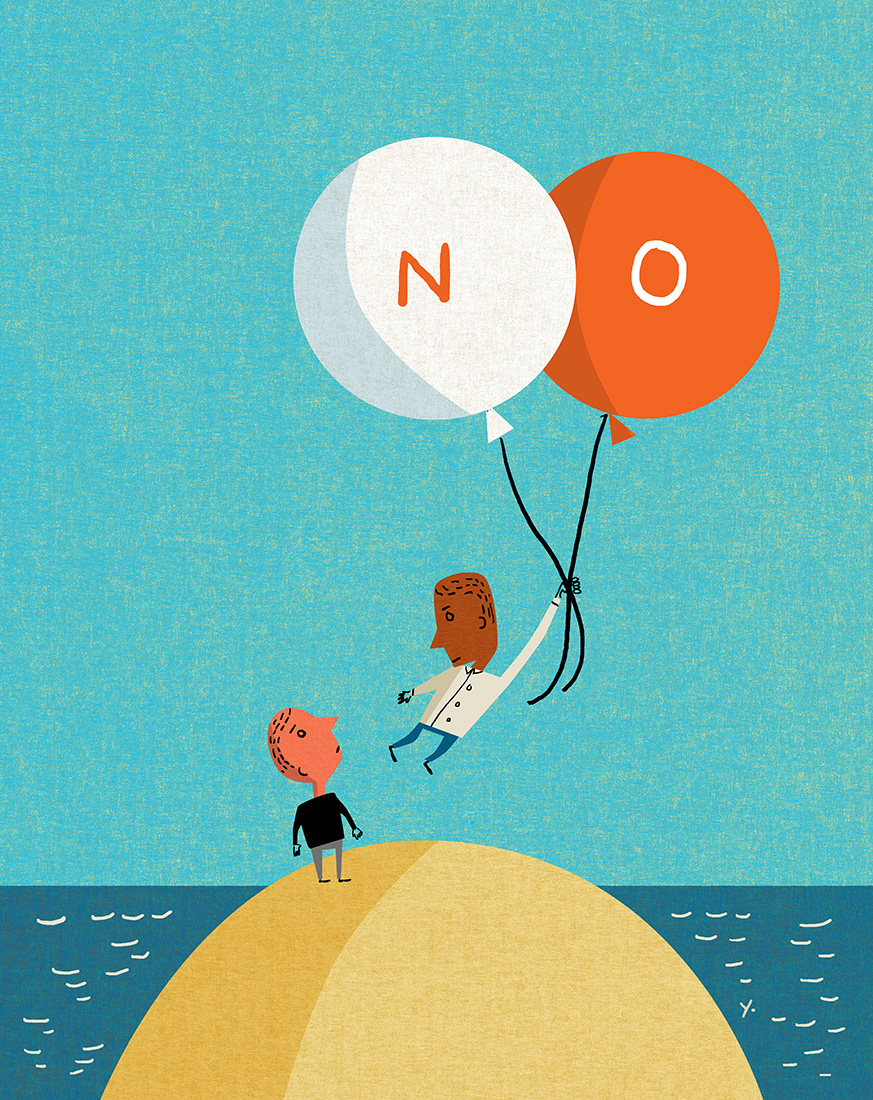
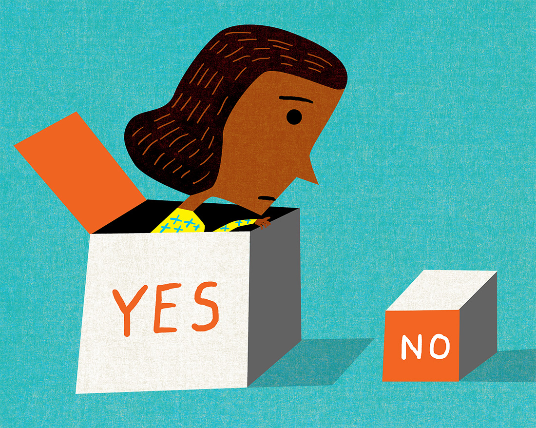
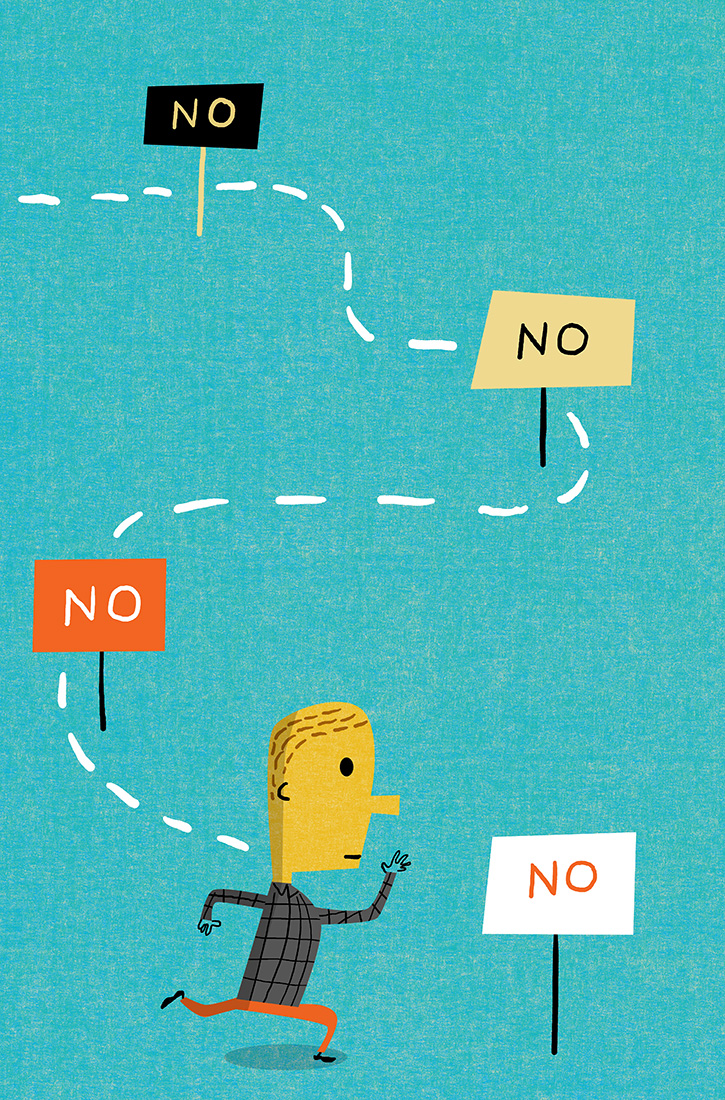
Experience Life called with a fun assignment which has good lessons for everyone in a hectic world. They requested a series of illustrations about the benefits of saying no. If you are unable to say no, you become bogged down and it harm your mental and physical health. As a person who used to say yes all the time, it is a nice reminder to spend your time more wisely. Much thanks to Jennifer and Experience Life for an assignment which is perfect for illustration.
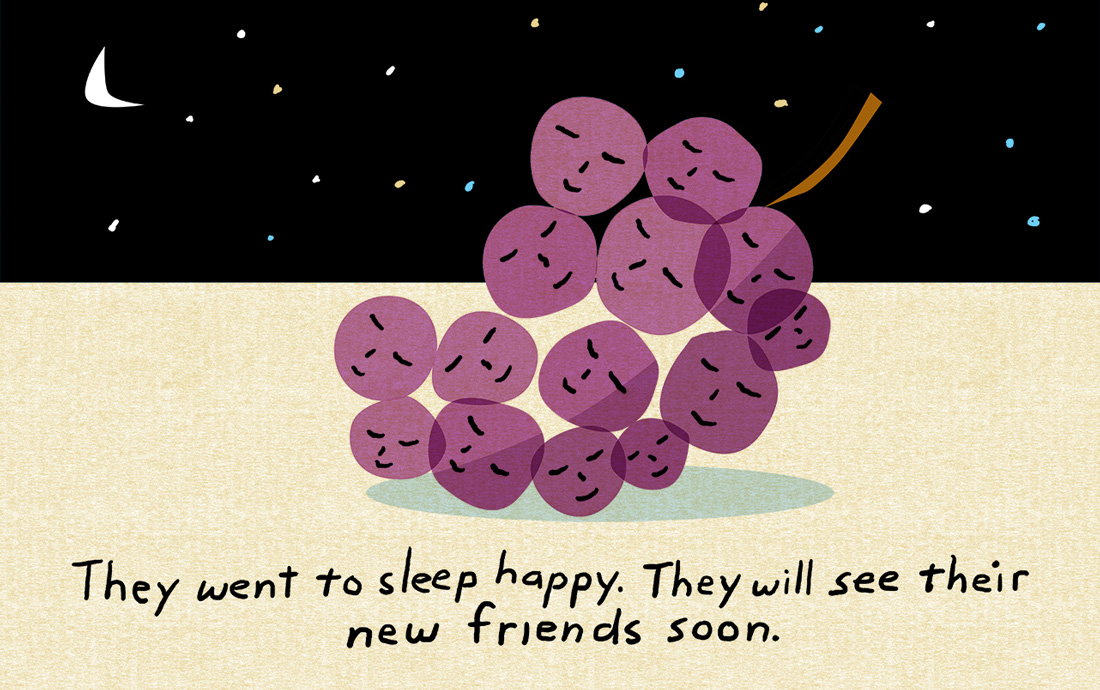
iammama.com: The Lost Grape
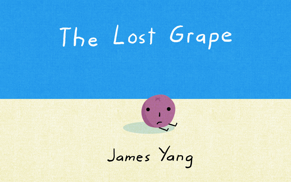
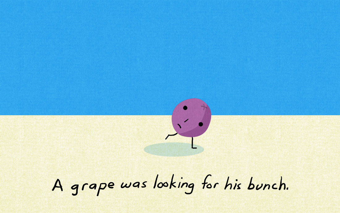
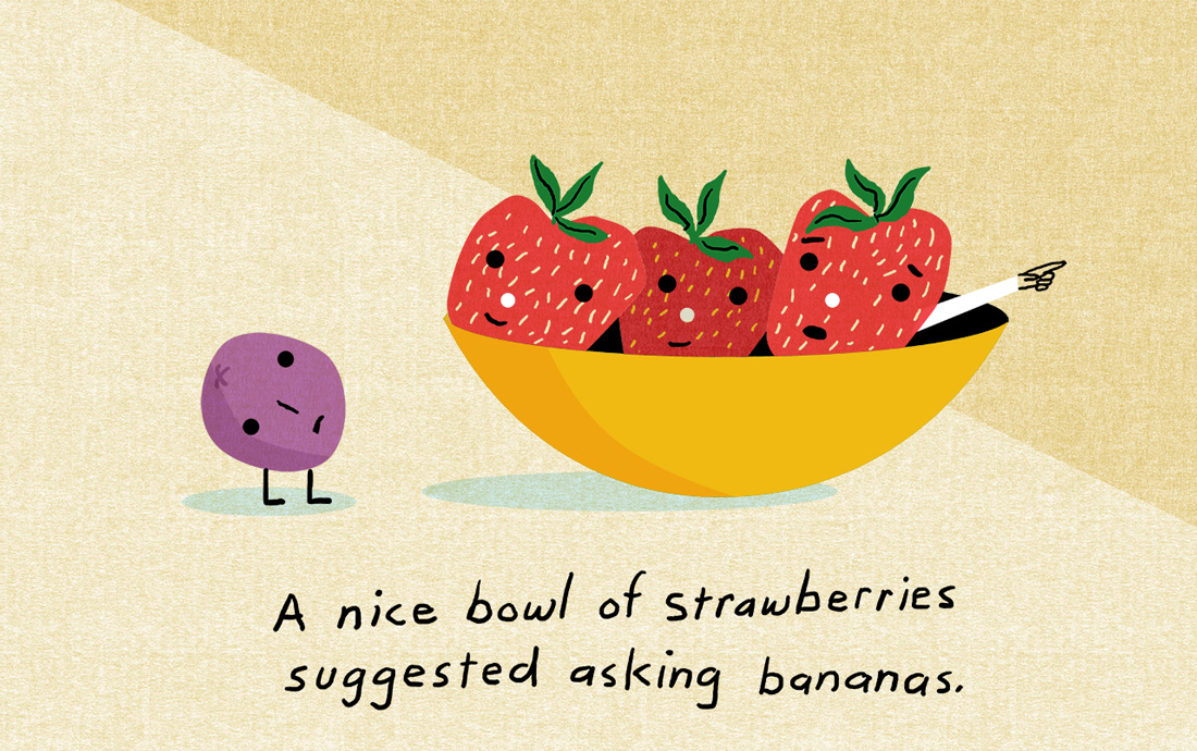
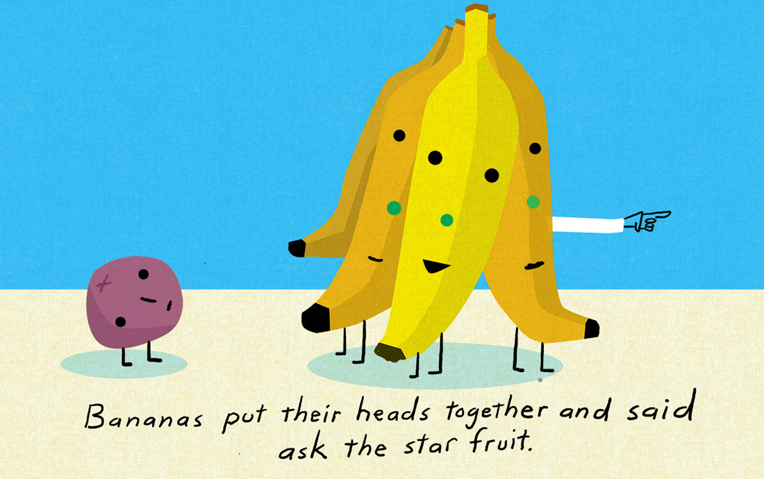
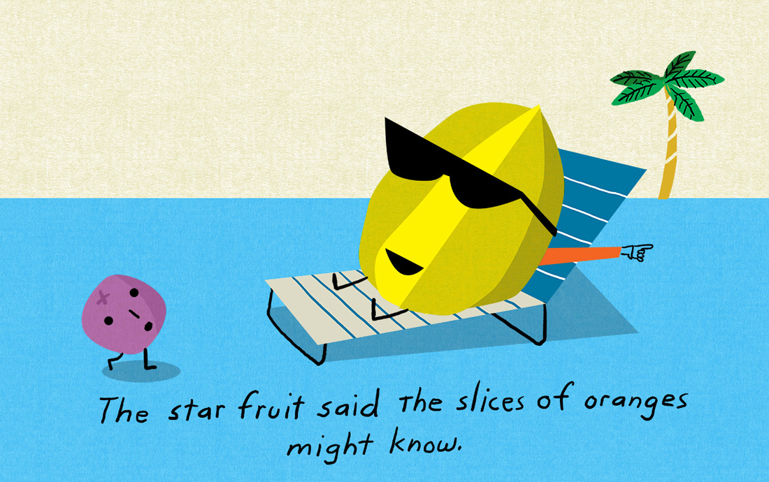
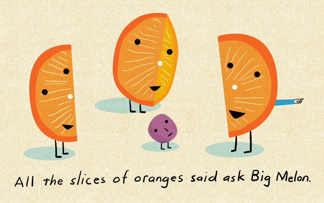
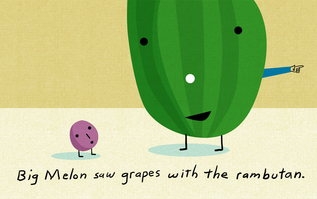
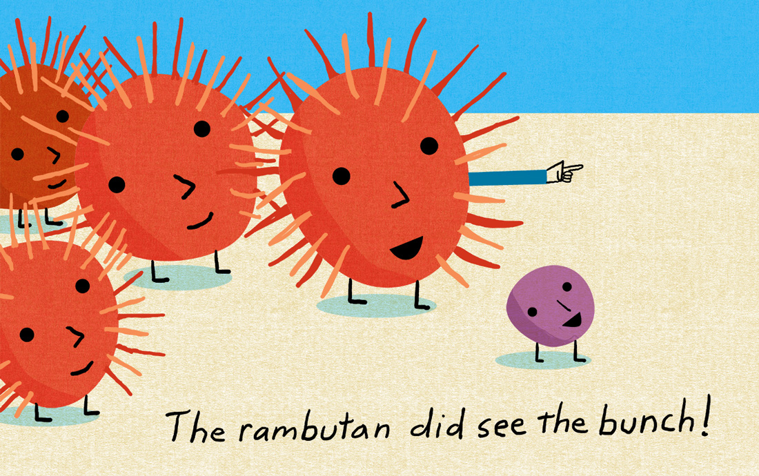
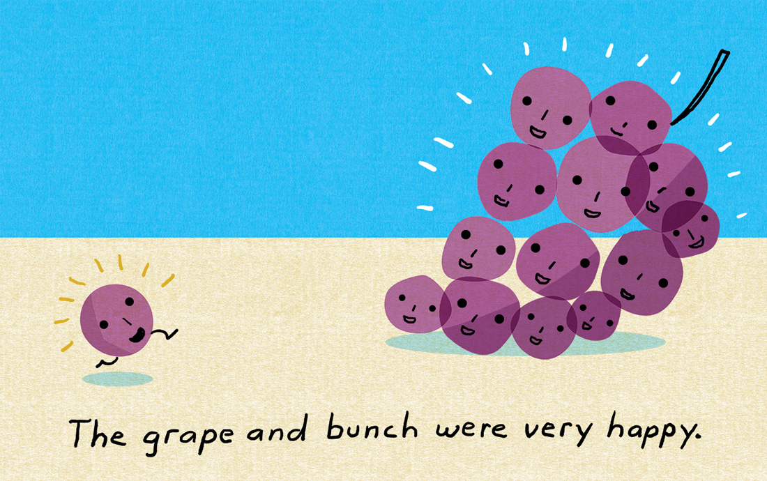
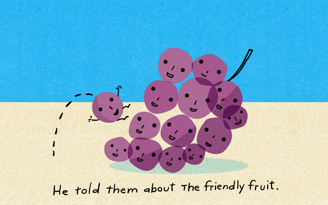
iammama.com has been a wonderful experience for telling quick visual stories for children.The second story is about a lost grape who is looking for his bunch. Along the way he meets a variety of fruits. It’s been a lot of fun telling stories and have already heard from a 4-year old that she approves of the stories.
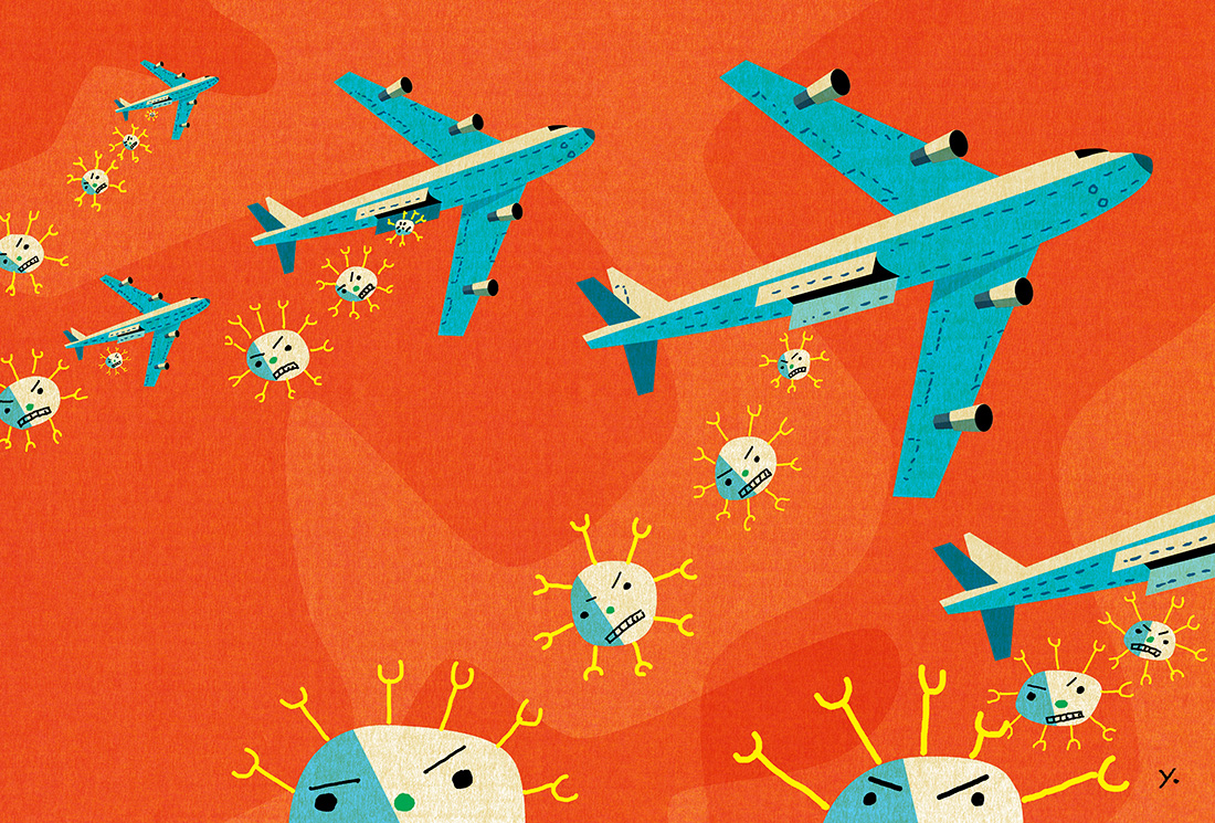
Scientific American: Cancer Killers
My father was a chemist so it’s always exciting whenever AD Michael Mrak calls with an assignment from Scientific American. The feature was about research to improve T-Cells abilities to fight cancer and become “super soldiers”. One of my favorite films in elementary school was an animated short which used soldiers as a metaphor for vaccines fighting the flu. It was meant to encourage us to not be afraid when getting shots. This was the perfect chance to mix a childhood memory with a great story.
Here’s the spread for the art:
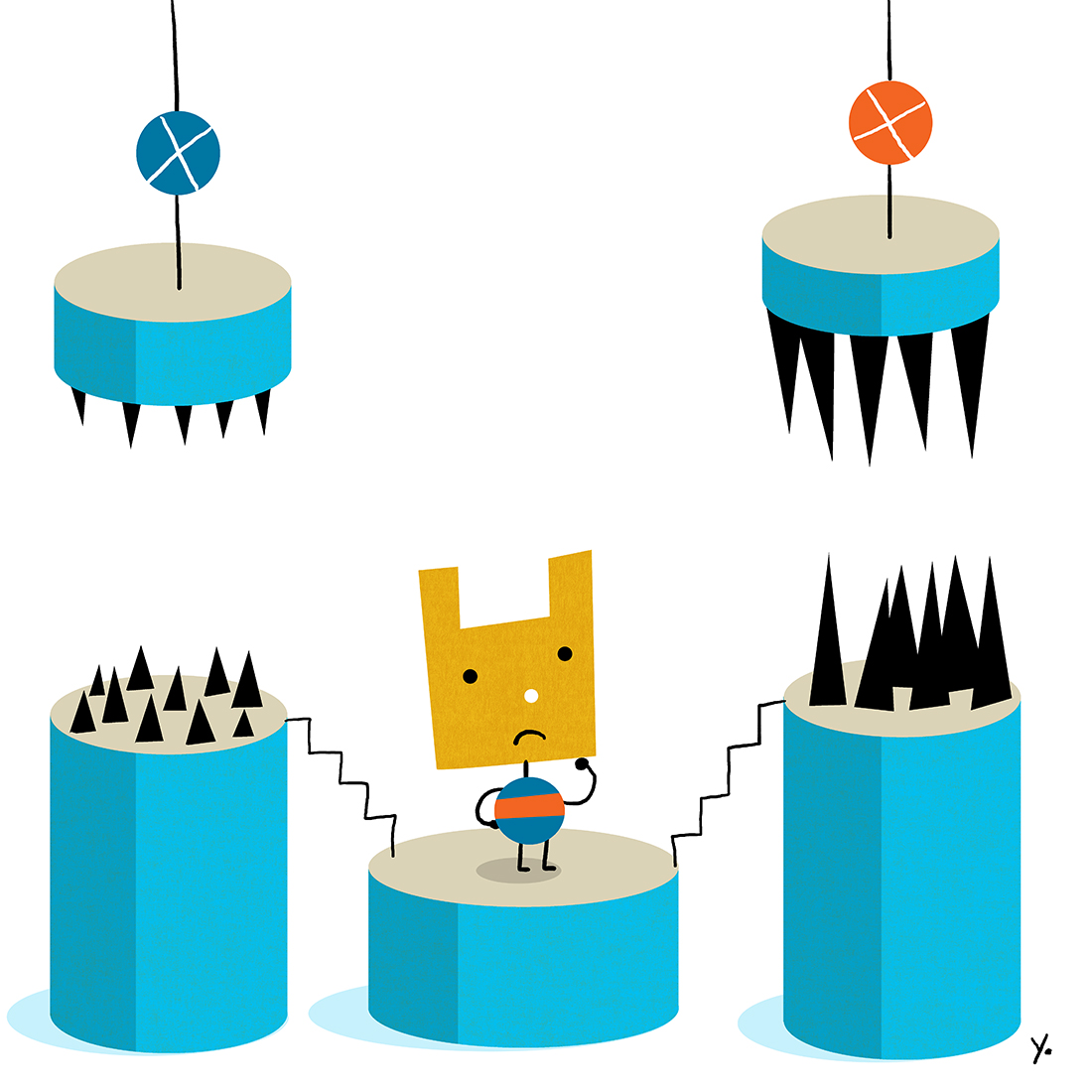
Two for Chief Investment Officer Magazine: The New Year and Sophie’s Choice
SooJin Buzelli at called for CIO Magazine and as always, it’s a pleasure working for her. She had a couple of stories about the planning ahead. The first story is about better forecasting methods for next year and the second is about pensions where workers have to choose between a little pain now or much larger pain in the future. The year is still young but it looks like a year with a lot of unexpected twists and turns.
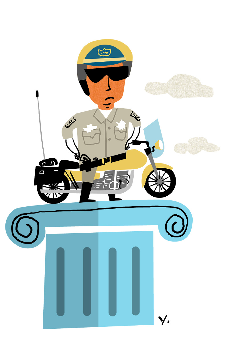
WSJ: The Glory of CHiPs
Sometimes the quick last second assignments can be the most satisfying. AD Keith Webb for the Wall St Journal asked if I could do an illustration for a humorous column about Eric Estrada upset that the movie version of CHiPs could damage the integrity of the original show. CHiPs isn’t even remotely high quality television but it’s a happy childhood memory so everyone can leave CHiPs alone.
