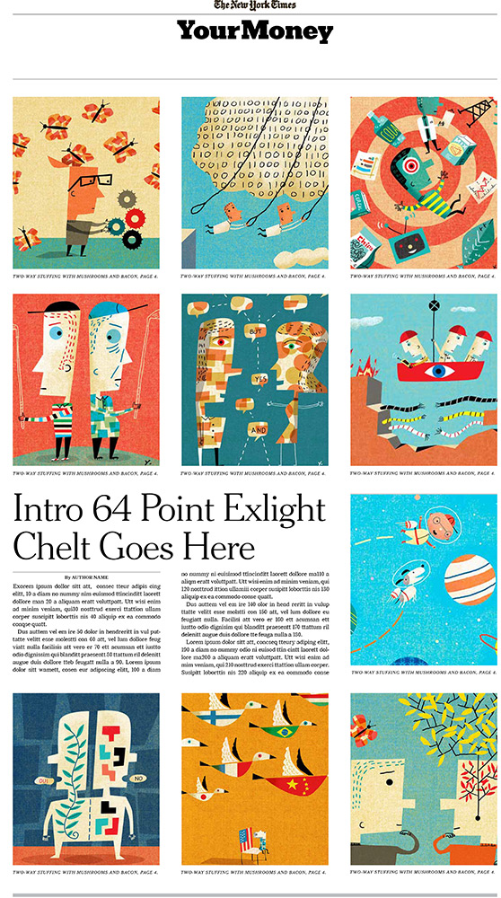
Fred Norgaard called with an exciting but scary project: he needed 10 illustrations over the weekend for a special section of the New York Times about your money. He provided a color comp pulling images from my site. I love when designers do this because it does help me understand the feel they want and it was clear Fred wanted something which popped off the page. There was definitely panic at the start because Fred pulled some of my strongest images for his comp. Since he wanted a variety of color schemes, it was helpful for planning the color sequence. I decided the dental image needed to have a dark background to provide a hub for the other images. Much to my relief everyone was thrilled with the final result and frankly, the color comp Fred provided was a huge help.
Here’s the final layout:
And here was the comp:

